Building a Data-Driven Customer Journey Map with Emotion AI Insights
If you walk into a Customer Experience (CX) workshop, you will almost certainly see a wall covered in sticky notes. “The user feels happy here,” a UX designer might say, placing a pink note on the “Checkout” phase. “They feel anxious here,” says a marketer, placing a blue note on the “Shipping” phase.
This is a Fantasy Map.
While well-intentioned, traditional journey mapping is often an exercise in creative guesswork. It relies on what internal stakeholders think the customer feels, or at best, on what customers say they feel in surveys days after the event.
But as we know, the “Intention-Action Gap” means customers are unreliable narrators of their own subconscious experiences.
To build a map that actually drives revenue, we need to move from “Post-its” to “Data Points.” We need to build a Data-Driven Customer Journey Map, a living visualization that overlays hard biometric data (facial coding, eye tracking, and sentiment scores) onto the standard sales funnel.
In this guide, we will walk through the step-by-step process of conducting an Emotion AI study and plotting the results to visualize the invisible.
This guide focuses on practical execution. For a comprehensive overview of the underlying biometric technology and its applications, refer to our central resource on the topic: The Complete Guide to Emotion AI in Market Research: Decoding the Subconscious Consumer.
Step 1: Define the Scope and Recruit the Panel
A common mistake is trying to map “The Entire Customer Lifecycle” at once. This dilutes the data. A data-driven map requires precision.
The Scope: Micro vs. Macro
Choose a specific high-value flow.
- Macro: “First Purchase Journey” (Ad → Landing Page → Checkout).
- Micro: “Mobile App Onboarding” (Download → Sign Up → First Action).
The Panel: N=30
Unlike A/B testing which requires thousands of users for statistical significance, qualitative biometric testing relies on depth. A sample size of 30 to 50 participants is the industry standard for identifying emotional trends.
- Recruitment Criteria: Ensure the panel matches your actual demographic. A Gen-Z user reacts differently to a UI pattern than a Boomer.
- Tech Check: Participants must have a functional webcam and good lighting to ensure accurate facial coding.
Before you recruit a single user, you must align on the business goal. Are you solving for Churn or Conversion? Understanding the strategic “Why” behind this map is crucial for project success.For a deep dive into the business justification, read [Why E-Commerce Needs Data-Driven Customer Journey Maps]
Step 2: Mapping the Entry Point (The “Mood” Context)
Traditional maps start when the user lands on the website. Data-driven maps start before the click.
The emotional state of a user entering your site dictates their behavior. A user arriving from a high-energy TikTok ad has a different “Entry Mood” than a user arriving from a somber Google Search query about a problem.
The Action: Measure the Source
In your study, show the participants the advertisement before asking them to browse the site.
- Did the ad generate Joy? (High Energy Entry)
- Did the ad generate Fear? (High Anxiety Entry)
If your map ignores this context, you cannot explain why a “High Energy” user bounced immediately when landing on a “Low Energy” (boring) homepage. This is called an Emotional Disconnect. To effectively measure the pre-click ad experience, which dictates the user’s entry mood, learn about the methods outlined in [How Facial Coding Helps Brands Test Audience Reactions to TV Promos and Long-Format Ads]
Step 3: Plotting the “Highs” (Moments of Delight)
Now, the user is navigating your site. As they browse, the Emotion AI software generates a time-series graph of their emotional valence.
You are looking for Peaks.
The “Joy” Spike (Action Unit 12)
Identify the moments where the aggregate line graph spikes into positive territory.
Visualizing: On your map, mark these moments with a “Green Peak.”
Example: A user seeing the “Free Shipping” badge or the “Order Confirmed” animation.
The “Aha!” Moment
Look for a combination of Surprise (Eyebrow Raise) followed by Joy. This indicates discovery. If this happens on your Product Detail Page, you know your product photography is working.
These emotional highs are not just vanity metrics; they are revenue drivers. To fully validate the ROI of identifying these moments and see how they correlate directly with conversion rates and sales, explore the case studies in [Do People Feel Your Ads? How Emotion AI Boosts Sales]
Step 4: Plotting the “Lows” (Friction Hunting)
This is the most profitable part of the process. You are hunting for the Valleys—the moments where the emotional line drops below neutral.
The “Confusion” Cluster (Action Unit 4)
Look for areas where multiple users showed a Brow Furrow.
- Map Annotation: High Cognitive Load.
- Location: Often found on Comparison Tables or Filter Menus.
The “Frustration” Cluster (Action Unit 24)
Look for the Lip Press or Jaw Clench.
- Map Annotation: Friction / Rage Click Risk.
- Location: Often found on Form Validation errors or slow loading screens.
Device Differentiation
Crucially, you must segment your data by device. You might find that your Desktop map looks green (Happy), while your Mobile map looks red (Frustrated) at the exact same step. If the friction appears to be device-specific, especially on smaller screens, it’s essential to understand [How Emotion AI Improves Mobile App UX Testing and Design Decisions] For diagnosing broader, cross-device design flaws and tackling the root cause of these digital experience pain points, consult [Using Emotion AI to Spot and Smooth Out Digital Experience Pain Points]
Step 5: The Pivot (Predicting the Exit)
In every journey, there is a “Point of No Return.” This is the precise moment a user decides to commit or abandon.
On a static map, this is just an arrow. On a data-driven map, this is a predictive node.
By analyzing the user’s Eye Tracking (Focus) and Mouse Velocity (Purpose) leading up to this moment, you can assign a “Purchase Probability Score” to this step.
- High Focus + Neutral Face: High Intent (Calculating).
- Wandering Eye + Frown: Low Intent (Lost).
Mark this spot on your map as the “Intervention Zone”—the place where a chatbot or popup has the highest leverage to save the sale. To further leverage your map for predictive insights, learn how to refine your intent modeling for these “Maybe” moments in the in-depth guide [Can Emotion AI Predict Buying Intent? What’s Actually Possible Today]
Step 6: Extending the Map (The Post-Purchase Reality)
Do not stop at the “Thank You” page. In the subscription economy, the journey is circular.
Mapping the “First Run”
Ask your participants to unbox the product or set up the software while still recording.
- The Unboxing: Is there Delight (Joy) or Disappointment (Contempt)?
- The Setup: Is there Flow (Neutral/Focus) or Struggle (Anger)?
If your map ends at payment, you are blind to Churn. Extending the biometric map to the first 10 minutes of usage gives you the data needed to fix retention. For a detailed guide on how to map the critical “First Run” experience and identify customer struggle during product onboarding or setup, see [How Emotion AI Identifies Customer Struggle During Product Onboarding or Setup]
Visualization: How to Visualize the Invisible
You have the data. Now, how do you present it so your stakeholders actually use it?
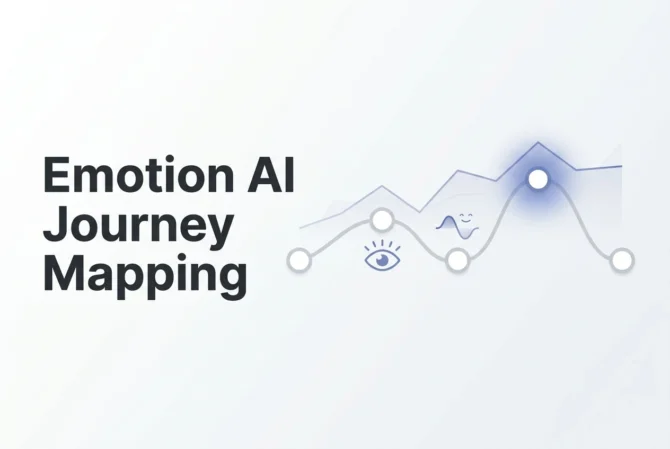
A Data-Driven Journey Map should look like an EKG readout, not a cartoon.
The Recommended Layout
- Row 1: The Steps (Landing → Browse → Cart).
- Row 2: The Screen (Screenshots of the UI at that step).
- Row 3: The Emotional Trace (The Biometric Line Graph).
- Y-Axis: Emotional Valence (-100 to +100).
- X-Axis: Time on Task.
- Color Coding: Green for Joy, Red for Frustration, Grey for Boredom.
- Row 4: The Heatmap (Eye-tracking thumbnails showing where they looked).
- Row 5: The Insight (“Users are confused by the shipping calculator”).
Tools for Visualization
- Miro / Mural: Great for collaborative layout.
- PowerBI / Tableau: For live data integration if you have a continuous feedback loop.
- Emotion AI Dashboards: Platforms like Realeyes or Affectiva often export these visualizations natively.
Conclusion: The Map is Your Dashboard
A traditional customer journey map is a document you look at once a year. A Data-Driven Journey Map is a diagnostic tool you use every sprint.
By visualizing the subconscious experience, you stop arguing about opinions (“I think blue is better”) and start solving problems (“The data shows blue causes confusion”).
This is the future of Customer Experience.
It is not about guessing; it is about knowing.
Call to Action: Stop relying on fantasy maps. Start plotting real human emotion. Pick one critical user flow this week, run a biometric study, and see what your customers are really feeling.
Frequently Asked Questions (FAQs)
What is the minimum sample size for a biometric journey map?
While quantitative analytics require thousands of users, biometric qualitative research typically reaches “saturation” (where no new insights are found) at around 30-40 participants. This provides enough aggregate data to smooth out individual anomalies and identify clear emotional trends.
Can I build this map using only Google Analytics data?
No. Google Analytics provides Behavioral data (what they did), not Emotional data (how they felt). You can infer frustration from a high bounce rate, but you cannot verify it without the biometric layer that Facial Coding provides. A true data-driven map requires both.
How do I integrate Eye Tracking into the map?
Eye tracking data is best visualized as Heatmap Thumbnails placed under the relevant step in the journey. If Step 3 is “Product Page,” place a small heatmap image showing that 80% of users looked at the Price but ignored the Description. This adds context to the emotional score.
Is this process expensive?
It used to be. Ten years ago, this required a physical lab. Today, using cloud-based Emotion AI platforms and remote unmoderated panels (where users use their own webcams), the cost has dropped significantly, making it accessible for mid-market brands, not just Fortune 500s.
How often should we update the Data-Driven Map?
Unlike static maps, this should be updated whenever you release a major UI change. If you change your Checkout flow, you need to re-run the study to see if you reduced the “Frustration” peaks or accidentally created new ones.
What is a Data-Driven Customer Journey Map?
A Data-Driven Customer Journey Map is a visualization of the customer experience that overlays biometric emotional data—such as facial coding, eye tracking, and sentiment graphs—onto the traditional funnel steps. Unlike guesswork-driven “sticky note” maps, this approach shows how customers actually feel at each moment, making it a diagnostic tool rather than a creative exercise.
How does emotional intelligence impact customer service?
Emotional intelligence in customer service allows brands to recognize when customers are confused, frustrated, or overwhelmed—often before they say anything. By integrating Emotion AI, teams can detect emotional friction in real time, resolve issues proactively, and design experiences that reduce anxiety and increase trust and satisfaction throughout the journey.
What is the “Point of No Return” in a Data-Driven Journey Map?
The “Point of No Return” is the moment in the journey when a customer subconsciously decides whether they will continue or abandon the process.
Emotion AI identifies this moment using:
- Eye tracking: Are they still focused or wandering?
- Mouse velocity: Are movements purposeful or aimless?
- Facial cues: Are they calculating or emotionally checking out?
This becomes the Intervention Zone—the step where a targeted fix (e.g., a chatbot prompt) can rescue the sale.
What tools are best for building these maps?
The most effective toolkits combine visual layout platforms with biometric analytics:
- Miro / Mural – For organizing the full customer journey visually.
- PowerBI / Tableau – For integrating emotional data over time.
- Emotion AI platforms (Realeyes, Affectiva, etc.) – To capture facial coding, attention, and sentiment traces.
Together, they create a map that looks more like an EKG than a storyboard—showing real emotional peaks and valleys.
What is the value of customer journey mapping?
Customer journey mapping helps businesses identify friction, amplify delight, and understand why customers behave the way they do.
A data-driven map goes further by revealing subconscious emotions that drive conversion or churn, guiding:
- Better UX decisions
- Higher conversion rates
- Reduced setup frustration
- Stronger retention
- More effective interventions at key moments
In short: it replaces assumptions with evidence, turning customer experience from guesswork into competitive advantage.