
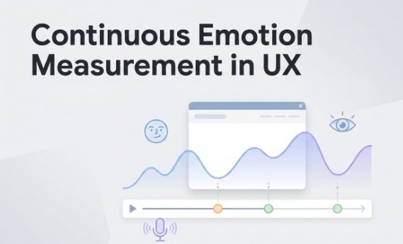
Beyond the Usability Lab: Why Continuous Emotion Measurement Is the Future of UX Insight
Participants say the experience is fine. Then it fails in-market, and your stakeholders start calling the research subjective. That gap, the one between what people report and what they actually feel, is where good insight dies. Continuous emotion measurement helps solve this. Instead of asking how someone felt afterward, you capture time-stamped signals while they’re having the experience. This shows you exactly when engagement drops or frustration spikes. But let’s be clear: this isn’t a mind-reading tool. It’s directional evidence that requires context. Here’s a practical look at what it is, what it measures, and how to use it responsibly.
Why do usability labs and self-report miss the moments that matter?
Traditional methods are episodic by design. A post-task survey boils 10 minutes of experience down to one rating. An interview asks participants to reconstruct emotions they’ve already processed and rationalized. By the time the question lands, memory and social pressure have already reshaped the answer.
Observer bias makes things worse. One moderator reads “hesitation” as confusion; another sees it as deliberation. The debate happens in the debrief room, not in the data.
What gets missed in all this?
- Micro-confusion on a single poorly-labeled button that a participant just shrugs off (but that later drives 15% of drop-offs).
- Disengagement at a specific moment in an ad that a viewer can’t name but clearly felt.
- “Polite” feedback that masks the genuine frustration people don’t want to voice out loud.
What is continuous emotion measurement (and what does it actually measure)?
Instead of a post-task rating, continuous emotion measurement captures affect-related signals in real time and aligns them to specific moments in the experience. You can think of it as a running record rather than a single snapshot.
Two dimensions are most important:
- Valence: Is the response positive or negative? This is useful for spotting delightful moments and frustration spikes.
- Arousal/activation: What is the intensity or engagement level? High arousal can mean excitement or anxiety, while low arousal can mean calm or disengagement.
Emotion isn’t just one thing. Different channels capture different facets of it. A person’s face, voice, and behavior don’t always agree, and that disagreement is often the most interesting signal.
It’s important to set a boundary here. These signals reflect likely emotional states across groups, not a universal map of what any one person is definitively feeling. Cultural norms, individual expressiveness, and context all shape what gets captured.
Which signals and modalities are most useful for UX and creative testing?
Each modality covers blind spots the others miss. When used together, they build a more complete picture.
Facial expressions These show moment-to-moment engagement and valence shifts. They’re useful for spotting when a creative scene or UX step triggers a real reaction, with the caveat that expressiveness varies widely across individuals.
Voice and language Tone can signal stress, confidence, or enthusiasm. Transcripts let you run text sentiment analysis across sessions at scale, surfacing language clusters that flag confusion or excitement without you having to watch every second of video.
Attention and behavior Eye tracking shows where attention went and when it dropped. Gaze plots and heatmaps map these reactions directly to interface elements or creative frames. This is how you prove “no one looked at the CTA” rather than just hypothesizing it.
When modalities conflict, like a smiling face paired with frustrated language, that’s often a signal worth investigating. Social masking, cognitive load, and fatigue all tend to show up this way.
Connecting reactions to specific screens or scenes requires time-aligned capture. For example, facial coding can map engagement and distraction in real time, while eye tracking shows the where behind the reaction. This turns “they seemed confused” into a locatable, actionable finding.
How do you turn emotion signals into UX actions and stakeholder-proof evidence?
Charts of emotion data don’t move anyone. Actionable decisions do. Here is a four-step path from signal to action:
- Mark events. Before the session, tag screen changes, task transitions, ad beats, and feedback prompts. Signals only become useful when they’re anchored to something specific.
- Look for spikes and drops. Flag moments where engagement falls or negative valence rises, tied to your event markers. Patterns that appear across participants carry more weight than any single peak.
- Validate with “why.” Follow up with targeted probes right after the key moment, then compare that feedback to transcript sentiment and themes. Stated and unstated responses need to corroborate each other. If they don’t, that discrepancy becomes the finding.
- Convert to decisions. Redesign the screen element. Reorder the information architecture. ad beat that consistently triggers disengagement. You can then prioritize fixes by frequency and intensity, not by who spoke loudest in the debrief.
Pairing these automated signals with transcript analysis gives you a readout where unstated reactions and stated feedback reinforce each other. That’s the kind of evidence stakeholders need.
What does a practical study design look like for remote sessions?
You don’t need a lab. You just need consistency.
- Standardize stimuli and event markers so signals align to the same moments across all participants.
- Control remote conditions. A brief pre-session lighting and camera check and minimizing background distractions go a long way.
- Build in micro self-report prompts at key moments. One or two quick ratings can help anchor your interpretation without breaking the user’s flow.
- Plan for variability. Individual baselines differ, so compare within-person changes rather than raw scores between people. Recruit enough participants to surface patterns, not just outliers.
What are the biggest risks, and how do you handle them?
Noise and artifacts. Remote capture can introduce lighting variation, compression issues, and odd camera angles that affect signal quality. Don’t over-read single peaks. Look for patterns across people and moments; they are far more reliable than isolated spikes.
Individual differences. One person’s neutral face is another’s distress signal. Baseline expressiveness varies. Treat signals as relative to each person, not as absolute readings.
Ethics and privacy. This is non-negotiable. Get explicit opt-in. Tell participants what’s being captured (face, voice), why you’re capturing it, how long the data will be stored, and who can access it. Practice data minimization by collecting only what you need for the study, and handle all of it securely.
Automated tools like transcription and generative AI summaries reduce the manual work, but they don’t replace the researcher’s judgment needed to turn themes into solid recommendations.
When presenting your findings, use boundary-setting language: “This indicates likely engagement shifts, which we corroborated with what participants said and did.” That framing protects your credibility and keeps the insight honest.