
Have you ever visited a landing page, felt completely lost, and clicked away within seconds? If so, you are not alone. In the digital world, first impressions are almost instantaneous, and a landing page has only a brief moment to win over a visitor. Designing a high-converting landing page is a delicate blend of art and science. While aesthetic appeal and persuasive copywriting are crucial, the true secret to digital performance lies in direct user feedback.
When you test your website design with real people, you uncover invaluable insights into how they naturally navigate, think, and feel. Performing a standard UI UX Test allows you to look past personal assumptions and see exactly where users get stuck, confused, or delighted. By applying these specific test findings to your structural layouts, you can systematically remove friction points, build credibility, and significantly boost your conversion rates.
Uncovering What Grabs (and Holds) User Attention
Every successful landing page starts with a strong visual hierarchy. You need to know exactly where your visitors look first and whether they are seeing your most important information.
Using advanced user testing methods like eye tracking and session recordings, you can map out visual interest with precision. Here is how these insights help you redesign your page:
- Validating the Hero Section: Your hero section should clearly state what you offer and what the visitor should do next. Testing helps ensure that users focus on your main value proposition rather than getting distracted by background decorative graphics.
- Smoothing Out the F-Pattern Reading Flow: Most web users read digital screens in an “F” or “Z” pattern. By analyzing gaze data, you can place key text and media elements right along this natural viewing path.
- Balancing Visual Accents: If test results show that a colorful background illustration is drawing attention away from your primary call-to-action (CTA), you can adjust the contrast, size, or placement to restore visual balance.
Optimizing Calls-to-Action for Maximum Action
The call-to-action is the ultimate destination of your landing page. If visitors cannot find it, find it unappealing, or feel hesitant to click, your conversion rate will suffer.
A focused UI UX Test reveals how users interact with your buttons and forms. By examining these behavioral insights, you can make targeted design improvements:
- Improving Visual Prominence: Use color psychology and generous whitespace to ensure your CTA button stands out clearly from the rest of the page.
- Action-Oriented Microcopy: Test different button labels. Often, swapping generic phrases like “Submit” for value-driven language like “Get My Free Guide” or “Start My Trial” yields much higher engagement.
- Simplifying Complex Forms: If users consistently abandon your page at the sign-up form, your test results will highlight exactly which fields are causing friction. Reducing form fields to only the essentials is one of the fastest ways to increase sign-ups.
Creating a Delightful, Friction-Free Navigation Experience
When a user lands on your page, their journey should feel effortless. Any moment of confusion—such as a link that does not look clickable or a menu that is hard to navigate on a phone—can cause them to leave.
By analyzing user navigation patterns during testing, you can build a highly intuitive layout:
- Responsive and Mobile-First Layouts: A massive portion of your traffic arrives via mobile devices. Testing ensures that your buttons are easy to tap, images scale beautifully, and text remains highly readable on smaller screens.
- Intuitive Interactive Elements: Users expect certain visual cues, such as a hand cursor when hovering over a button or highlighted links. Testing ensures these micro-interactions work perfectly, making the digital journey feel natural.
- Optimized Page Speed and Performance: Slow loading times are a major friction point. Behavioral tests often show that high bounce rates are directly linked to slow-loading media assets, allowing you to optimize performance where it matters most.
Building True Trust Through Emotional Connection
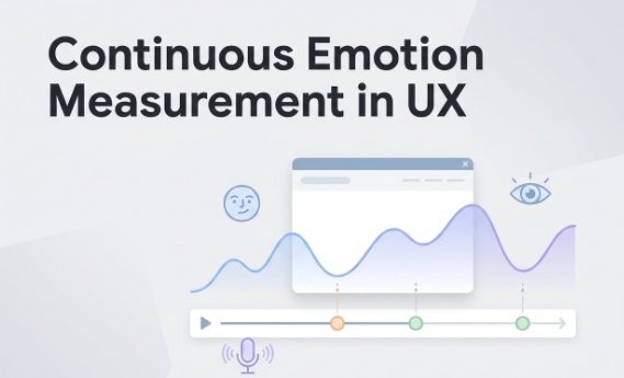
To convert a visitor into a customer, you must establish a sense of trust and security. This is where advanced metrics, like text sentiment analysis and facial coding, become incredibly powerful.
By measuring real-time engagement and unstated emotional responses, you can design a page that resonates deeply with your target audience:
- Placing Social Proof Wisely: Test where to display client testimonials, security badges, and industry awards. Showing these elements right when a user experiences a moment of hesitation can reassure them and encourage them to take action.
- Evoking the Right Emotional Tone: The imagery, color scheme, and language you choose should match the emotional state of your visitor. Emotion-aware insights can help you determine if your design feels welcoming, professional, and reliable.
- Ensuring Authentic Copywriting: Clear, honest, and helpful copy builds strong relationships. Testing helps you refine your messaging so that it speaks directly to your audience’s needs and aspirations.
The Path to Continuous Optimization
Landing page design is not a one-time project; it is an ongoing process of refinement and growth. By treating your design as a living system informed by real user experiences, you can consistently adapt to shifting user behaviors and market trends. Relying on concrete behavioral data ensures that every layout change, font selection, and color adjustment directly contributes to a better user journey and a stronger bottom line.
Frequently Asked Questions
What is the difference between A/B testing and a UX test?
A/B testing is a quantitative method where you compare two versions of a page to see which one performs better based on metrics like click-through rates. A UX test is a qualitative method that focuses on why users behave the way they do, revealing their thoughts, emotional responses, and specific points of confusion as they navigate your page.
How many users do I need to run a helpful design test?
For qualitative insights, testing with 5 to 8 users is often enough to uncover about 80% of the major usability issues on a landing page. This allows you to make significant improvements without needing a massive testing budget.
Can eye tracking really help improve my landing page conversions?
Yes, eye tracking is highly effective. It provides a visual map of exactly where users look and what they ignore. This helps you position your headline, product benefits, and CTA buttons in the areas that naturally receive the most visual attention.
How often should I test my landing page design?
It is ideal to test your design whenever you introduce major layout updates, launch new products, or notice a sudden drop in your conversion rates. Continuous, iterative testing ensures your page remains highly effective as user preferences evolve.